ARCHISPORT
Unveiling ArchiSport, a vibrant association dedicated to revitalizing French neighborhoods through sports and leisure activities for people of all ages. Our mission is to create a lively and welcoming community, and our brand identity reflects just that.
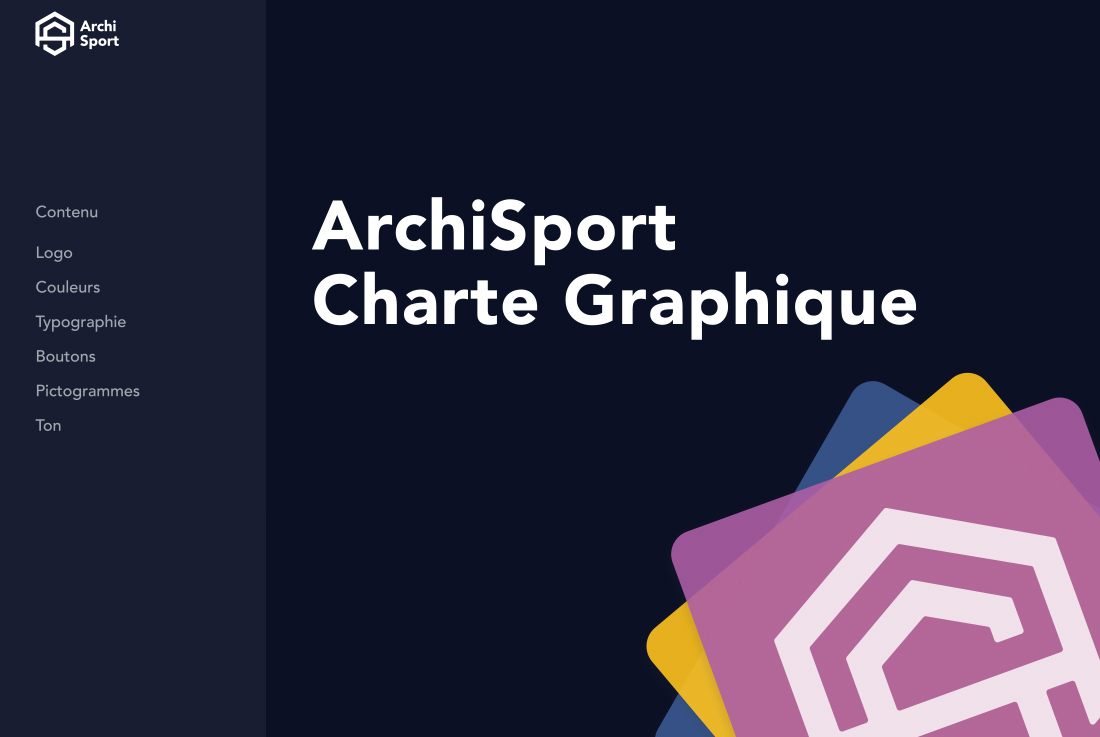
To ensure consistent and effective use of our brand identity, we have developed a comprehensive set of graphic guidelines. This graphic charter empowers ArchiSport’s volunteers to utilize the graphic elements appropriately and provides new volunteers with a quick overview of how to use the association’s graphic elements. It covers the tone of communication and design, the possibilities to be explored, and the rules of use to avoid style inconsistencies.
Inspired by the world of comic books and superheroes, we have designed a logo that exudes power, dynamism, and a sense of belonging. Our logo is a modern reinterpretation of classic superhero emblems, blending comic book aesthetics with minimalist design principles. This fusion results in a unique and distinctive emblem that perfectly encapsulates the spirit of ArchiSport.
Our color palette is as diverse and vibrant as the activities we offer. With a range of gradients and hues, we capture the energy and enthusiasm that is at the heart of our association. Our primary colors, Gentian Flower #2757FF and Liberty Blue #0b1025, evoke a sense of modernity and freshness, while our secondary colors, Smashed Pumpkin #ff6a40, Yellow Jacket #ffcc3d, and Electric Laser Lime #19ff3b, bring warmth and dynamism to the brand.
To make our brand even more personal and engaging, we allow our members to choose their favorite color from our palette, with the exception of purple. This way, ArchiSport becomes not just an association, but a community that celebrates individuality and variety.
Each sport offered by ArchiSport has its own color representation: blue for swimming, blue/black for judo, orange/red for basketball, yellow for tennis, and green for archery. This color-coding system not only adds a visual appeal to our brand but also helps our members identify their favorite activities easily.
To complement our logo and color palette, we have chosen Avenir as our primary typeface. Its modern, geometric look perfectly aligns with our brand’s aesthetic and enhances its overall visual appeal.
ArchiSport’s brand identity is designed to communicate our message in a personal, authentic, and friendly way. We aim to create a vibrant and energetic community!


