

APMO
APMO is a distinguished portfolio management company with a brand identity that reflects its professionalism and expertise in the industry. The design approach for the brand’s graphic identity is thoughtful and intentional, capturing the essence of the company.
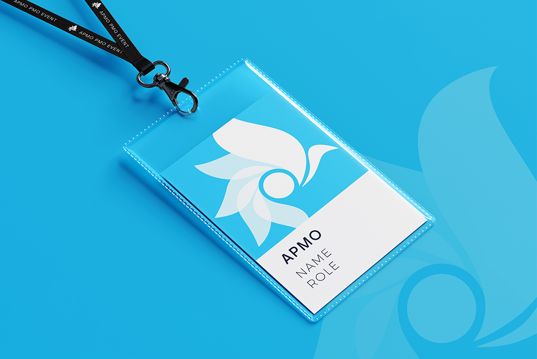
The brand’s identity is deeply rooted in its French heritage, which is beautifully reflected in the choice of color – blue. The blue in APMO’s logo is a soft, yet vibrant shade that echoes the blue of the French flag. This color choice signifies the company’s commitment to maintaining a calm and composed demeanor, even when handling substantial budgets and navigating through complex financial landscapes.
Moreover, the blue also signifies trust, reliability, and stability – values that are at the very core of APMO’s business. To further emphasize the company’s positive and optimistic approach, a lighter hue of blue was chosen for the brand image. This reflects APMO’s forward-thinking approach and its commitment to achieving growth for its clients.
The brand icon is the rooster, a proud symbol of France, embodying vigilance, courage, and resilience. Much like the rooster, APMO is always alert, keeping a close eye on the market trends to seize opportunities and mitigate risks. The rooster also represents the company’s unwavering commitment to waking up each day with renewed energy and passion to deliver exceptional results for its clients.
APMO’s brand identity reflects its values, heritage, and commitment to delivering exceptional portfolio management services. The graphic identity is a testament to the company’s unwavering commitment to professionalism and a promise to always strive for the best for its clients.